A big redesign at The Hawaii Project
A new design for The Hawaii Project
I’ve just pushed live a pretty major update to the user interface and visual design for The Hawaii Project. (Thanks to Jim Fell for his visual mockup that drove most of the changes to the design. His conversations were immensely helpful. All mistakes and ugliness are, of course, mine.)
As a reminder, The Hawaii Project brings you books and book news you’d never have found on your own. We track what the web’s leading tastemakers and book reviewers are writing about, uncovering things that match your favorite authors, personal interests and current events, and bring them to you daily. 10% of our revenue goes to support 3 great literacy non-profits.
I had a few main goals with the redesign:
- Communicating that the books in The Hawaii Project are discovered by extracting which books trend-setting publications are writing about, and matching them to your interests.
- Moving to a more modern visual style.
- Removing much of the “UI” clutter.
The Hawaii Project works by scanning almost a thousand high quality web sources of writing about books. Everything from The New York Times book reviews to author blogs to niche blogs about special topics, like espionage books, politics or medieval history. It was clear people weren’t getting that, nor were they really aware there were “stories” at all in the system. That is a key differentiator, so it needed to become more obvious.
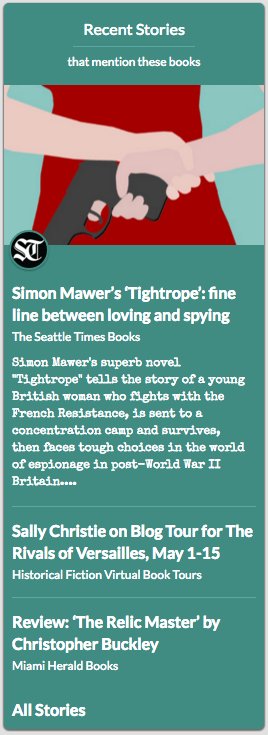
I radically simplified the Navigation bar so that “Books” and “Stories” were prominent, and introduced a “Recent Stories” panel into the Books page - showing images and snippets from a few stories, as well as highlighting the source of story via text and a logo, with a rollover highlight on the book mentioned in the story.
In moving to a more modern visual style, I wanted (needed!) to get rid of the many distractions and overly ornate visual elements in the existing design. The inspiration for The Hawaii Project was about that feeling of sitting on the beach reading a great book. The visual design tried to capture that with colors from the water, sand and palm trees, but the pages had 2 and sometimes 3 competing gradients (and heavy gradients at that). It wasn’t working.
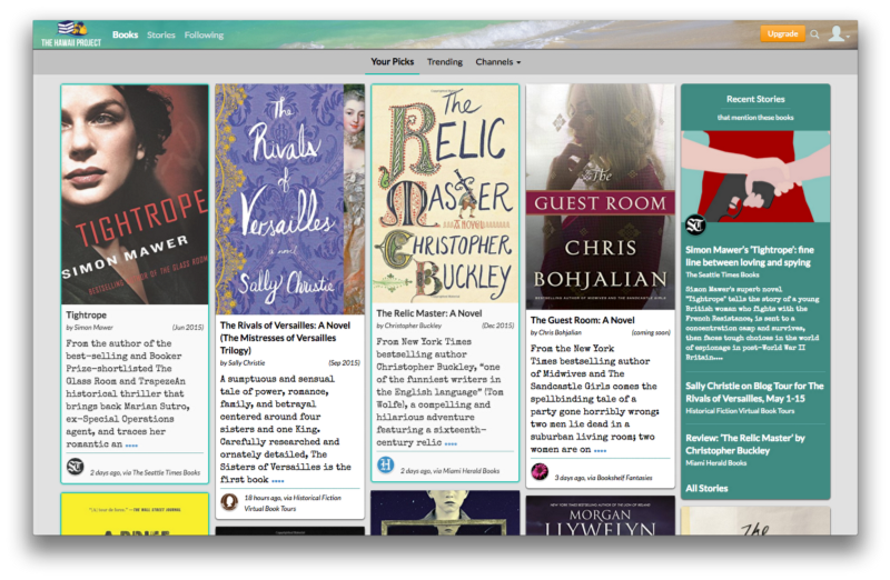
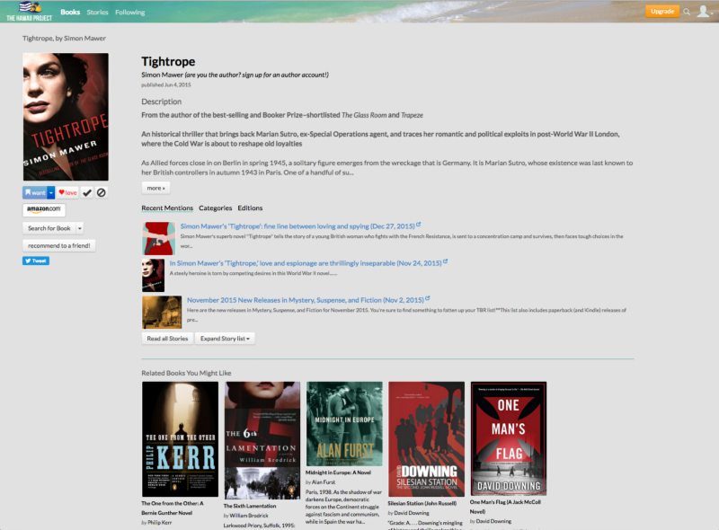
Here’s the previous design for the Books page and the Book page:
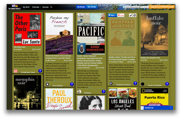
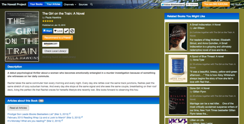
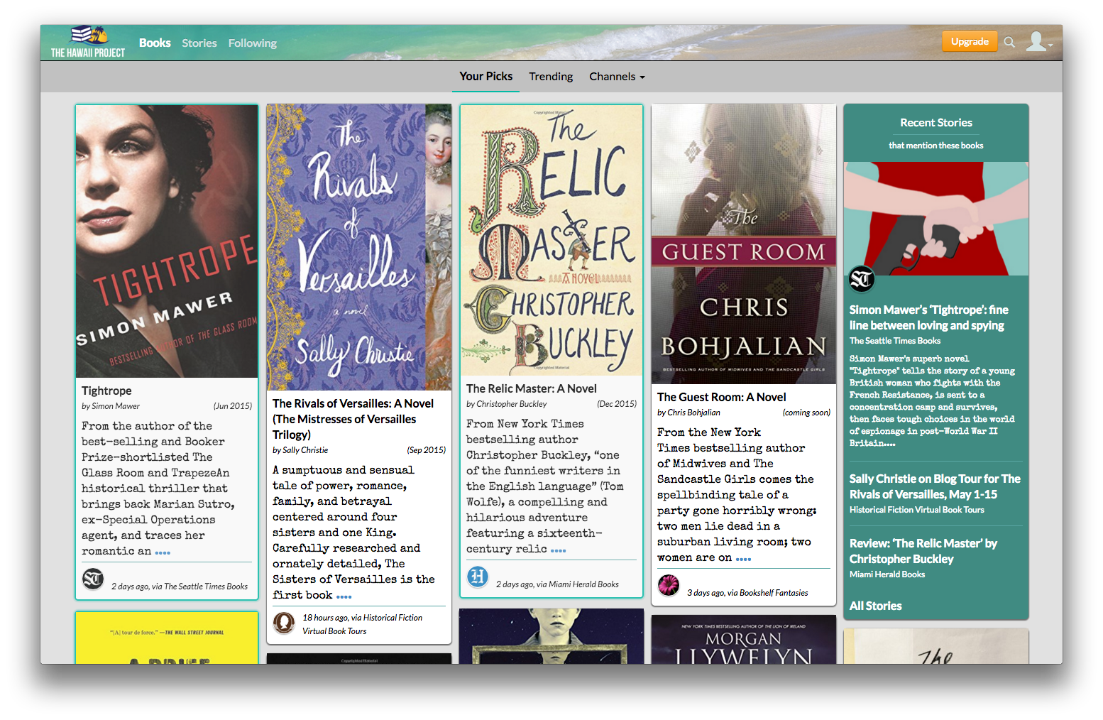
The new design removes virtually all gradients, gets rid of the heavy greens and brown colors, moves to a more typical grey background and black text, simplifies the number of fonts and font-sizes used in the design. It’s far easier on the eyes and much more readily scanned.
| Much UI clutter has been removed or hidden. The Navigation bar at top gets a new background image that’s more clearly beach-related, removes a number of extraneous items, and simplifies down to a simple choice of Books | Stories | Following, emulating Flipboard, Pinterest, Medium and the like, and makes clearer what the primary actions are: See Books, Read Stories, or Follow Sources and Authors to get more relevant information. User Account actions (customization, login, list maintenance, etc) are moved to a simplied User drop down (the silhouette menu). The User menu and Search are moved to the top right to get them out of the way. |
On the books page, various means of finding an actual copy of the book (OpenLibrary, Scribd, your local library, and so on) are moved to a dropdown, so they’re easily available but out of the way. Secondary metadata about a book (Editions, Categories) are hidden away in containers that can be opened as desired. Stories about a book get more visual play with the introduction of images as a splash of color to draw your eye to them.
Related Books, and the Author’s other books, are moved to the bottom of the page; they can be scrolled to as needed but don’t distract you on first page load.
Here’s the final designs as they are in production today:
